Home
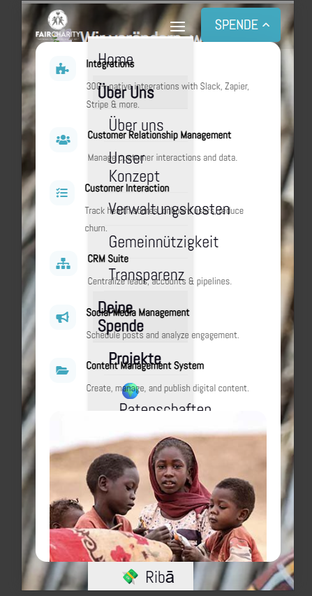
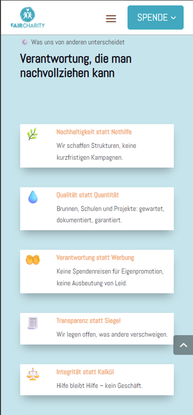
Responsive has two menus, and neither of them is correct.
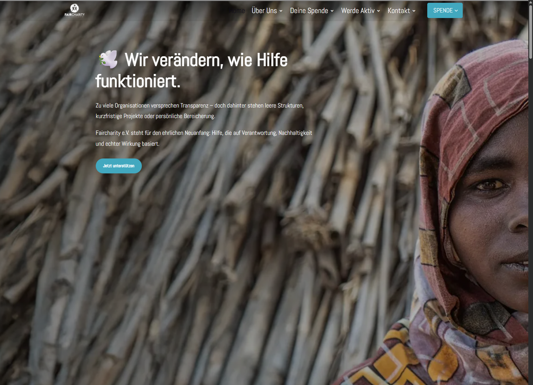
And the spacing at the top is not set correctly, nor is the background image responsive.
________________________________________________________________________________________________________________________________________________
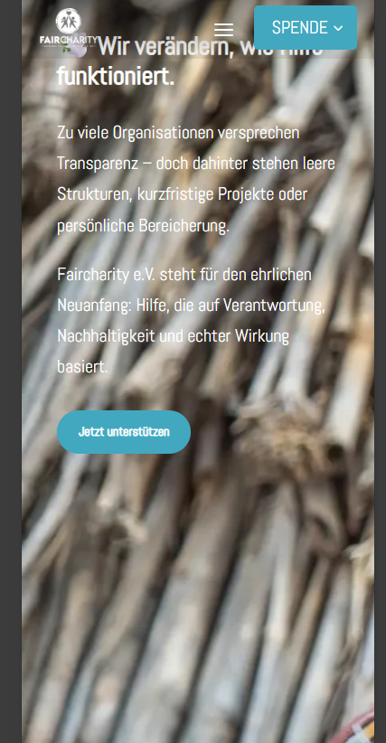
This area is much too high. Half of the page is lost and the image looks poor in responsive mode.
I will compile the images today and make them available.
________________________________________________________________________________________________________________________________________________
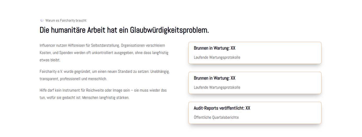
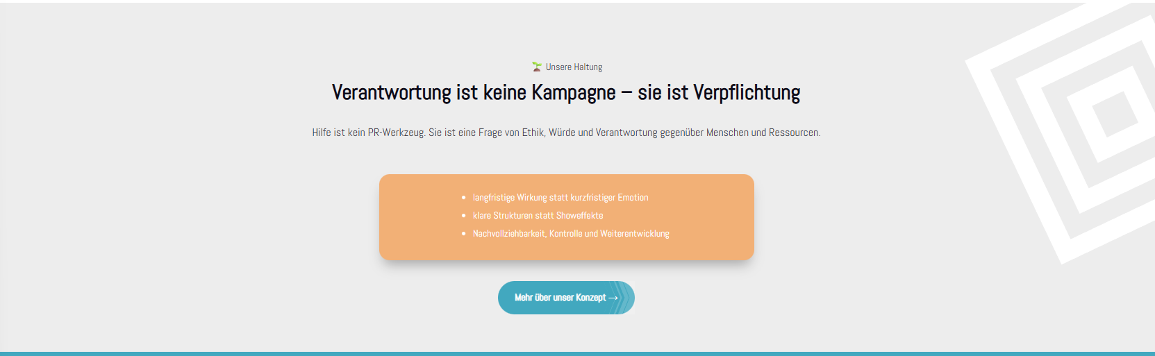
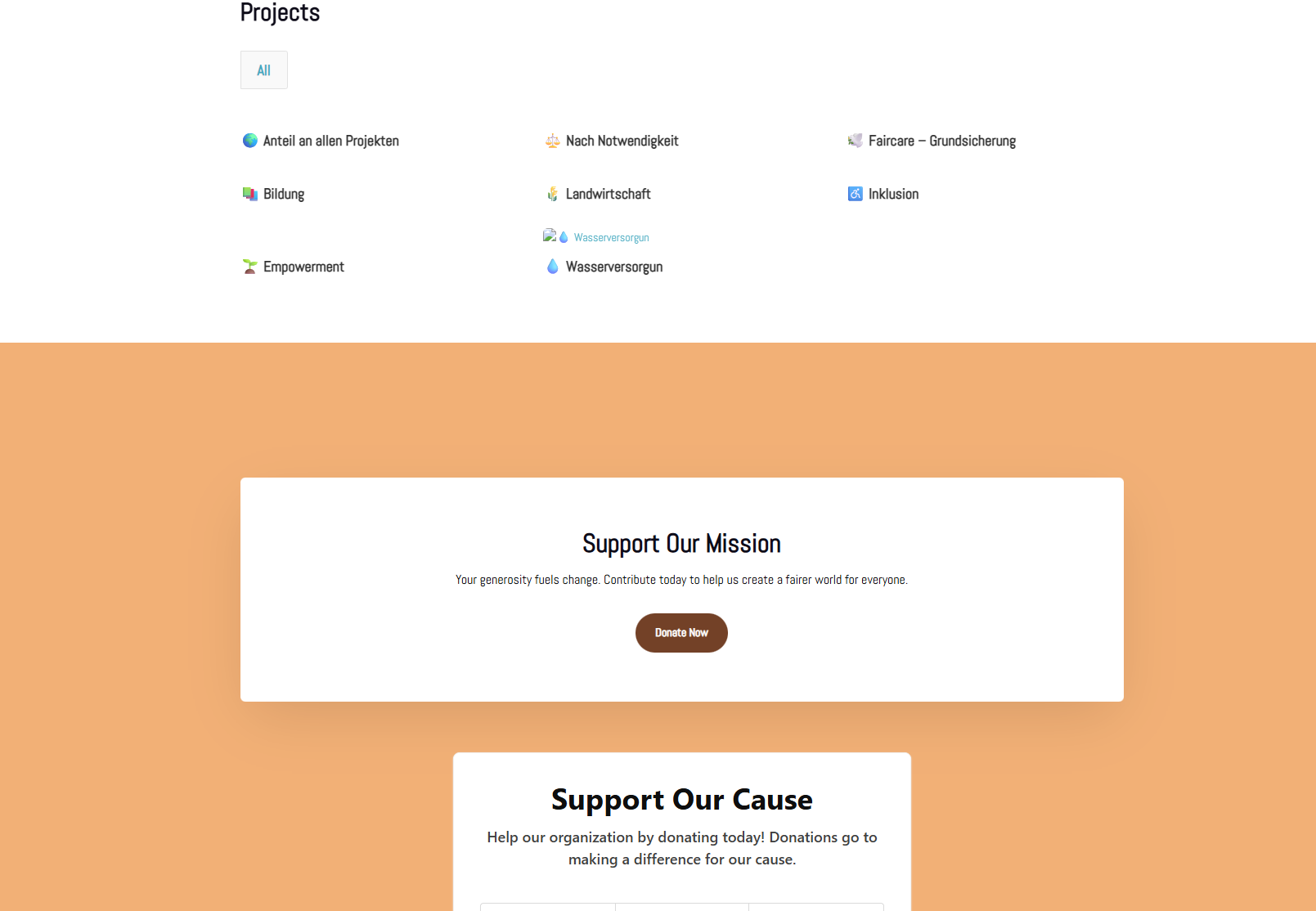
The idea is quite cool with the audit reports, wells under maintenance, etc. But that should be removed for now. Instead, you could add a ‘Learn more’ button here that leads to one of the ‘About us – Our concept’ pages.
________________________________________________________________________________________________________________________________________________
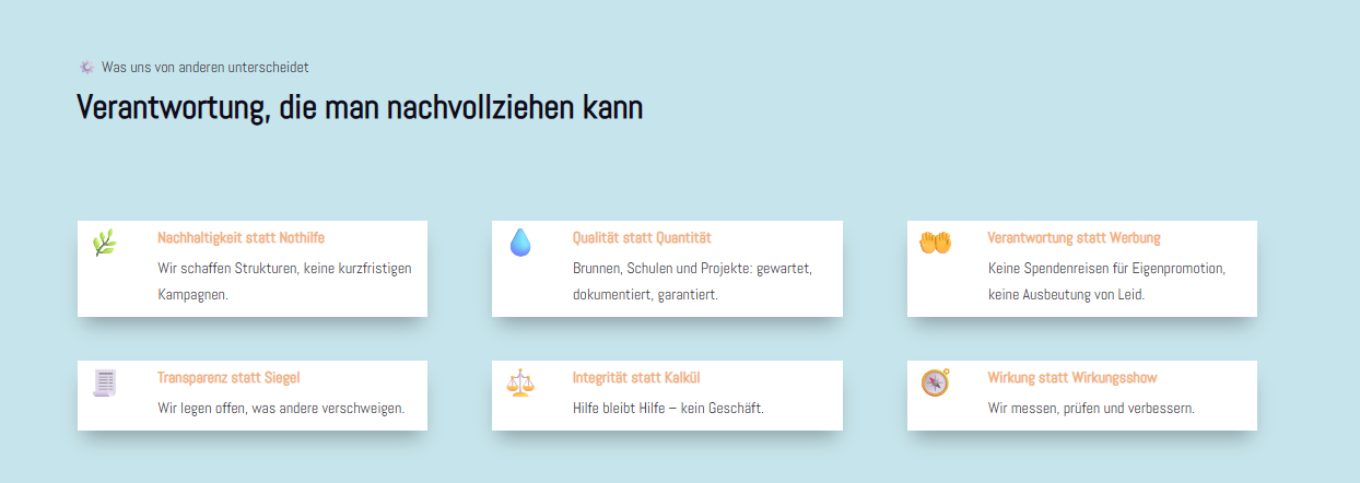
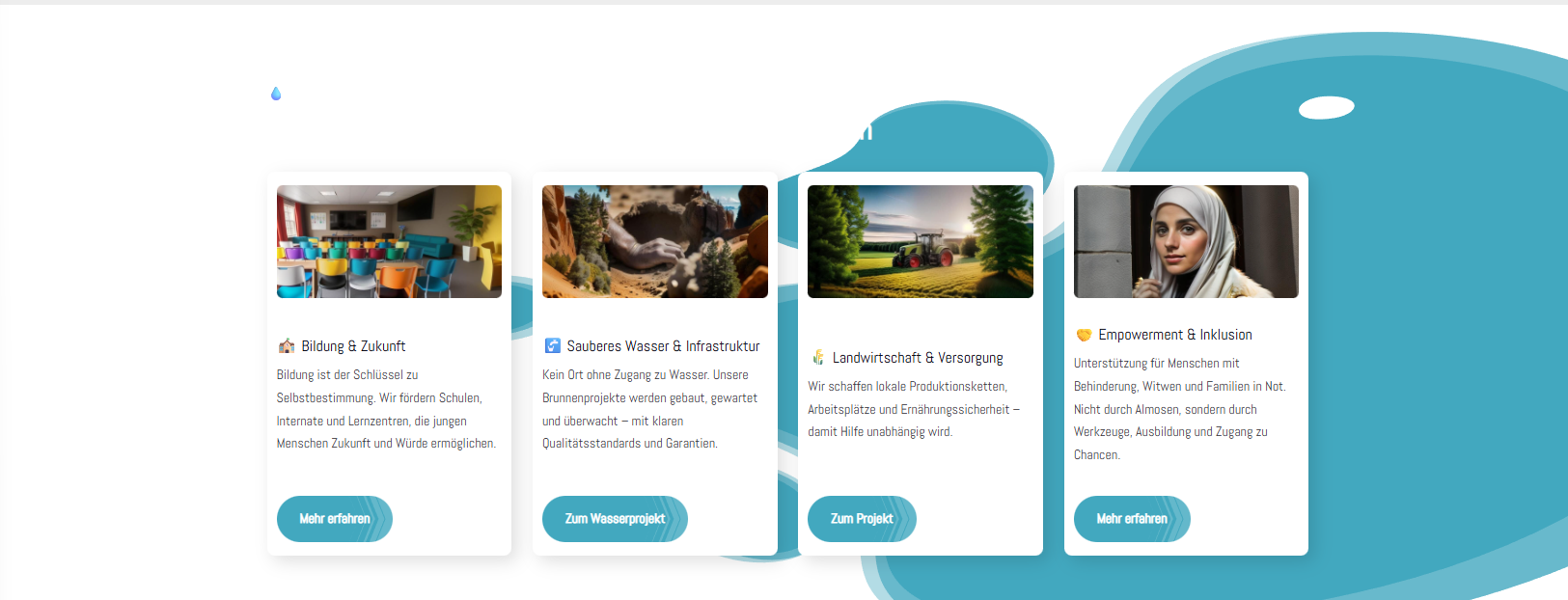
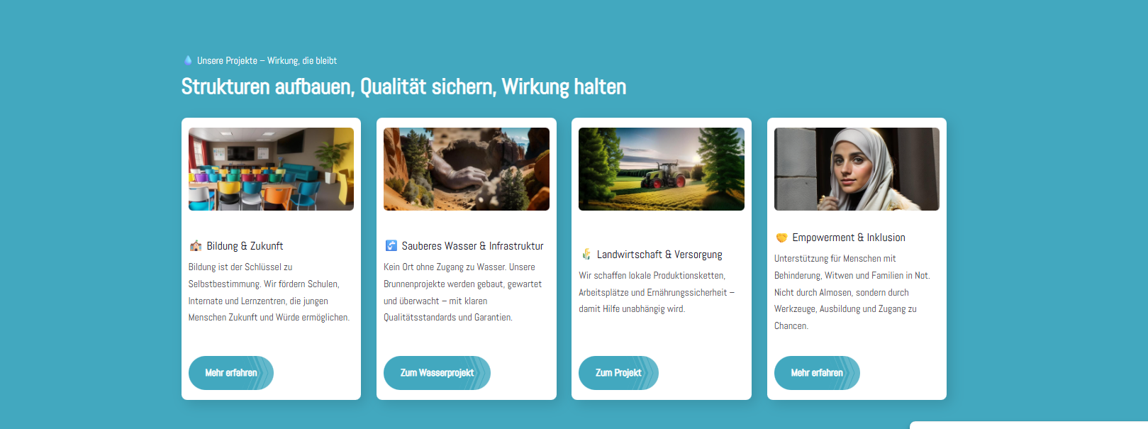
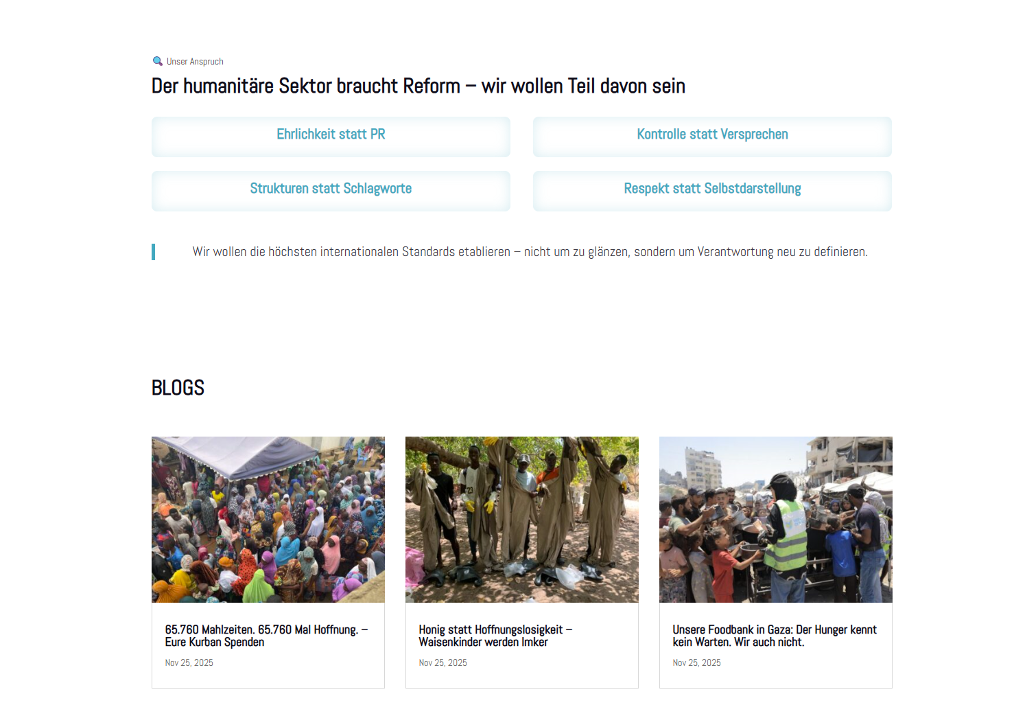
The boxes look bad. The icons are not centred. The spacing is strange. Please redesign this area. It should look more modern.
________________________________________________________________________________________________________________________________________________
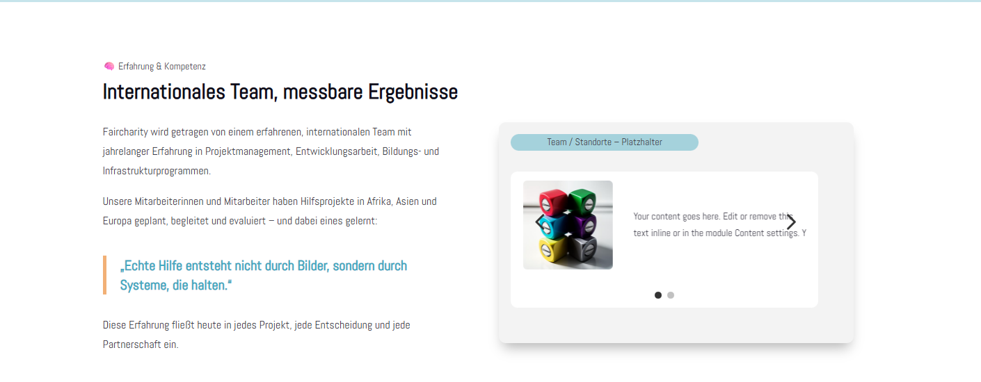
What exactly should be included here under Team/Locations? What information do you need to fill in these boxes?
________________________________________________________________________________________________________________________________________________
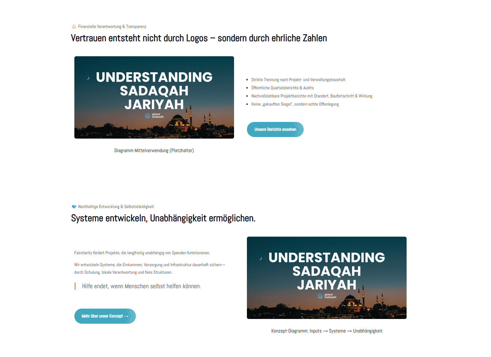
The background design isn't very nice. Could you please put something nicer in there?
________________________________________________________________________________________________________________________________________________
Here too, the design is not good.
________________________________________________________________________________________________________________________________________________
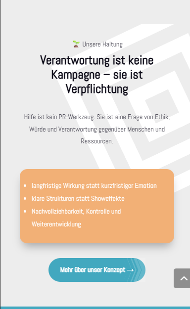
This should look a bit nicer here too. Too much white.
________________________________________________________________________________________________________________________________________________
Everything here can be removed.
________________________________________________________________________________________________________________________________________________
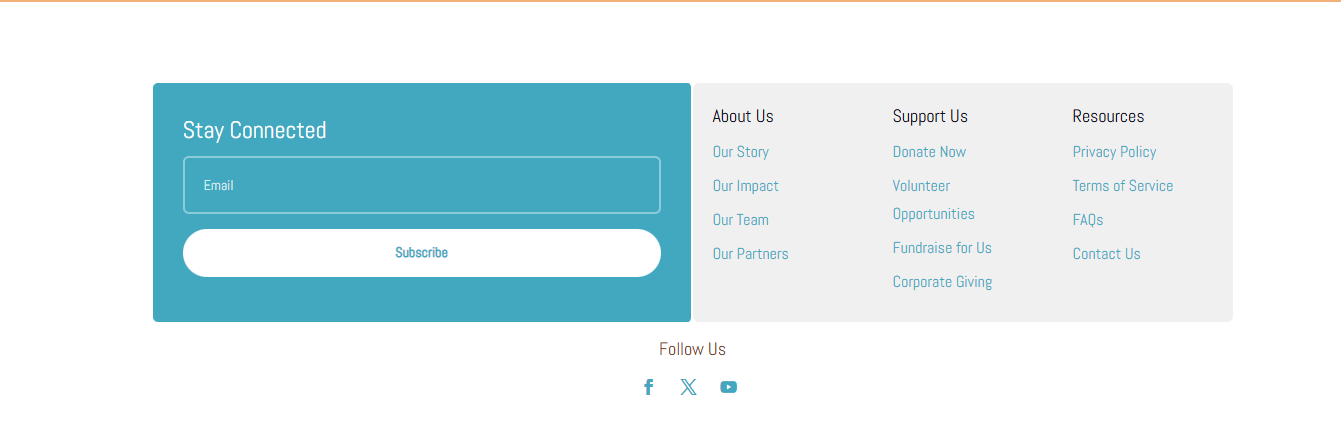
This needs to be properly revised to ensure that it has the correct names and links.