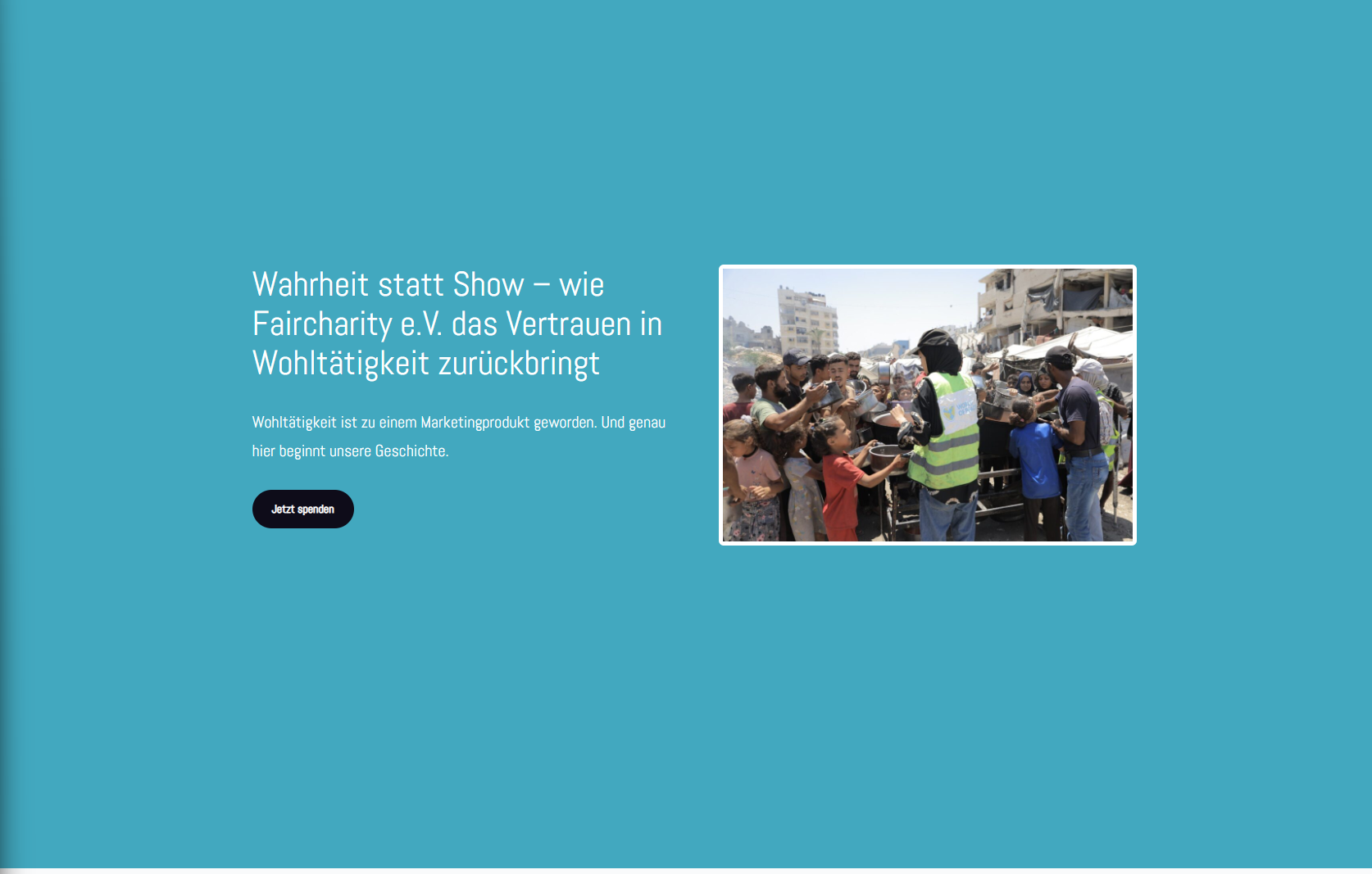
Über uns
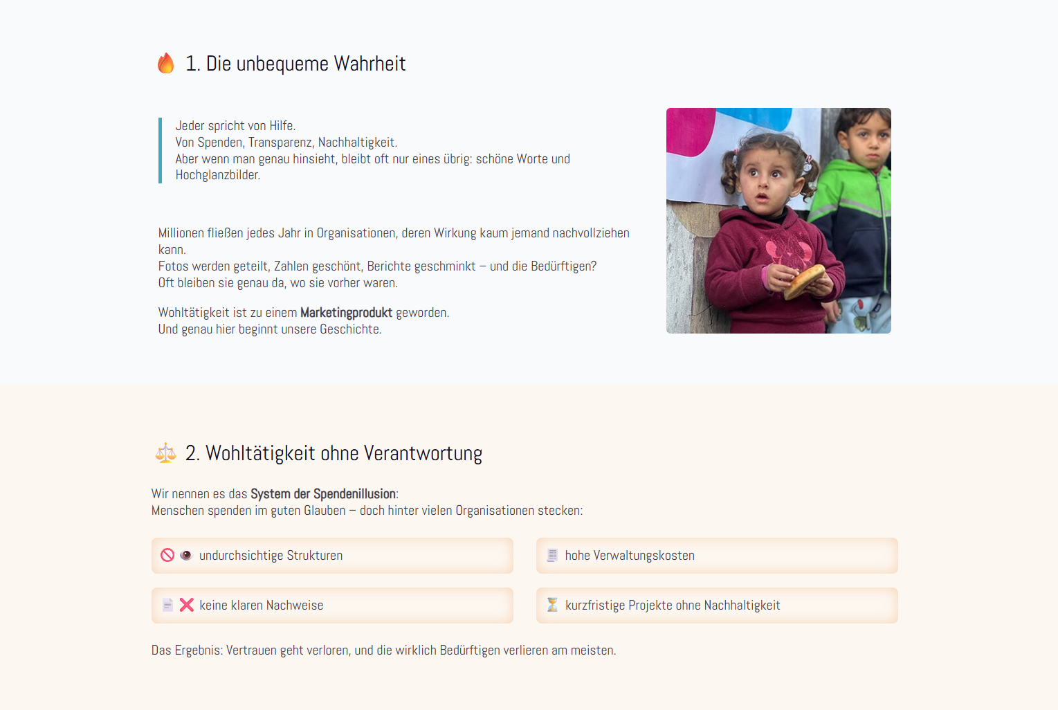
Same here, this area is much too large.
Please also adjust the donation button to match the corporate design.
________________________________________________________________________________________________________________________________________________
These three areas look a bit strange when placed one after the other. The boxes in particular should look more modern and be coordinated with each other.
________________________________________________________________________________________________________________________________________________
The boxes look unattractive. Can they be adjusted somewhat?
________________________________________________________________________________________________________________________________________________
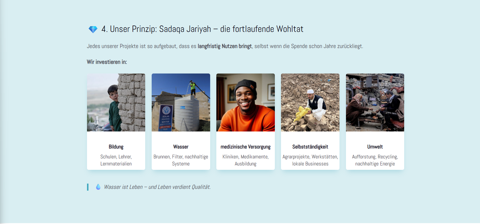
Here, too, there is the problem with the boxes. They all look a bit strange somehow.
________________________________________________________________________________________________________________________________________________
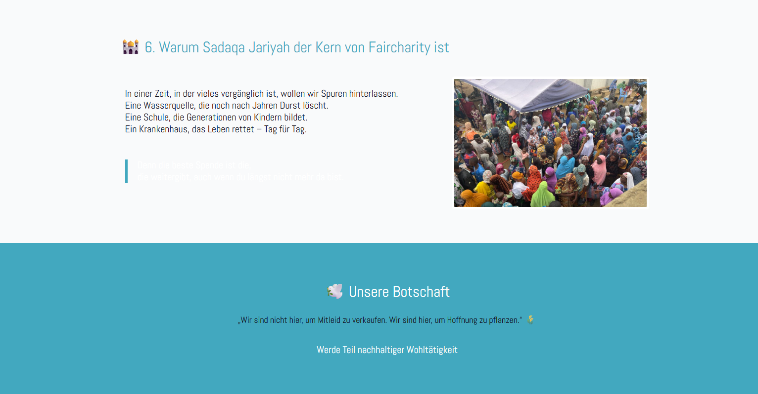
The design is also strange.
White text on a grey background?
The spacing is also somehow too large.
________________________________________________________________________________________________________________________________________________