Über uns
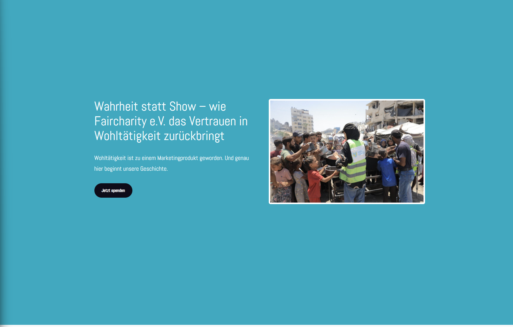
Heading too large and not enough space above the header
Same here, this area is much too large.
Please also adjust the donation button to match the corporate design.
________________________________________________________________________________________________________________________________________________
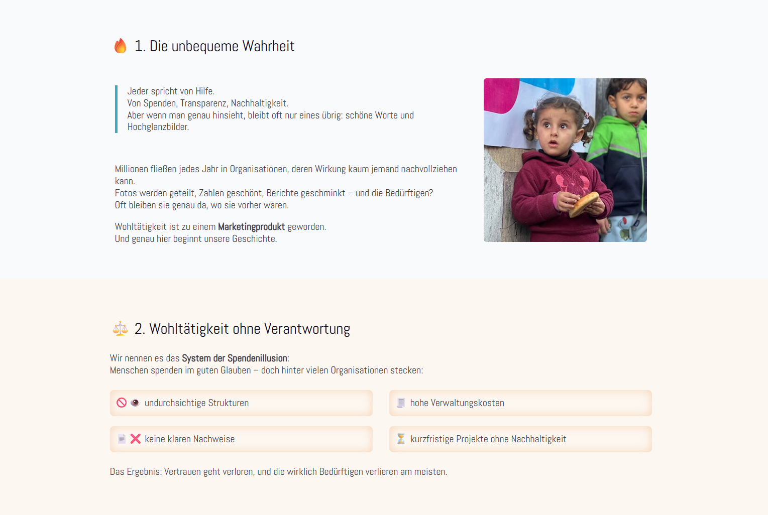
These three areas look a bit strange when placed one after the other. The boxes in particular should look more modern and be coordinated with each other.
________________________________________________________________________________________________________________________________________________
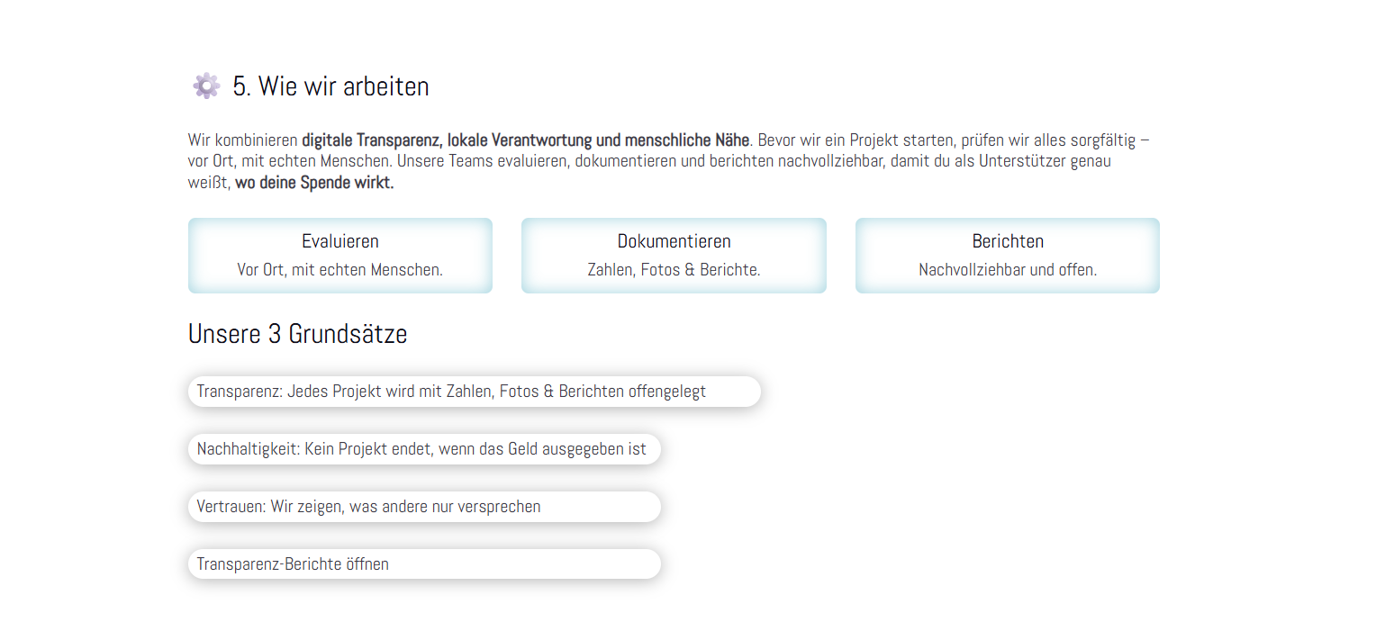
The boxes look unattractive. Can they be adjusted somewhat?
________________________________________________________________________________________________________________________________________________
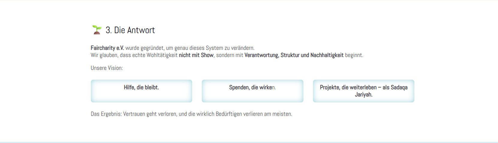
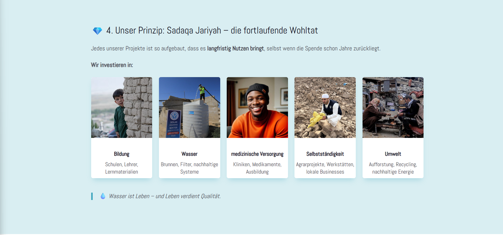
Here, too, there is the problem with the boxes. They all look a bit strange somehow.
________________________________________________________________________________________________________________________________________________
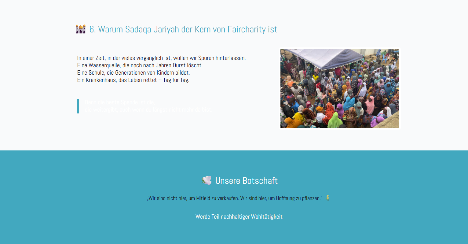
The design is also strange.
White text on a grey background?
The spacing is also somehow too large.
________________________________________________________________________________________________________________________________________________